The home is incredibly distinguished looking with blackened exterior planks made from trees damaged in the Cedar Fire.
The architects are Lindsay & Rory Brown of the design-build firm, The Brown Studio. From the Dwell site:
The 3,300-square-foot home was and built using reclaimed timber from San Diego forest fires, all of the finished timber materials are native California species.Natural rock retaining wall. The military makes bunkers in Iraq and Afghanistan the same way, by pouring loose rock into wire shells.
Such a stunning and unexpected house. The black against the blue sky was a stark contrast.
Love these poured concrete steps.
I spent a considerable amount of time on the home's many decks and terraces trying to get just the right angles. This house has spectacular views.
Sunset and a cocktail anyone?
Puffy San Diego Fall clouds made to order for the pictures.
The home is new construction on an old foundation. More from Dwell.
The home is an open plan concept with defined spaces, each opening outward to the ocean view. Interior areas are private yet connected, with large openings to an outdoor cooking area, private patios, a roof garden and deck, and view terraces.Let's step through the front door. All that glass is a cool optical illusion. Where is the door opening? Side note: see all the shoes lined up outside the window. NO it is not where the owners keep their shoes. It is our shoes, silly.
Just inside the front door was the dining room table. The brilliant painting in the back is on an old door, painted brilliantly.
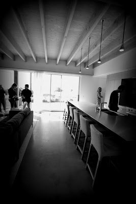
You step right into the kitchen around a divider wall forming a hall off the front door (are you following?). At this point, please understand that this house was crawling with people. These pictures were in the early afternoon and the tour was in full swing. So forgive me the lurkers. I have not perfected the glare that my colleague at The Brick House claims she uses to disperse unwanted picture subjects.
If this kitchen seems kind of massive and stark, well, it is. Bar for six of your closest friends, anyone?
Better picture of the polished concrete floor. You can see where old foundation meets new. Or something meets something.
Filter time.
Next -- the adjacent living room. A little Eames, in white anyone?
Downstairs powder. Plain, simple functional. Get in, get out.
I repeat, do NOT use this sink.
Quick stop by the downstairs guest bedroom
Has its own private patio.
And no baseboards! Remember my rant on this subject? (Wasn't trying to catch the missing face plates but apparently I did. Oops. Most of the homes on the tour were brand spanking new. This and that was still being installed or fixed. I am sure you can relate.)
Downstairs guest bath. Cool floating cabinets remind you of anything?
Ah, the toilet paper dilemma. My architect did not want me to install a fixture on the wall either. I ignored him (shocking). Glad to see the owners have their squeegee handy and ready to go, on the shower floor. Albert hates squeegeeing the bathroom. My friend's husband says his favorite thing about vacations is he doesn't have to squeegee the bathroom. Sad.
These stairs are so sculptural. Many things in this house are. Let's trot up the stairs where we'll bump into 40 or so people.
Closer inspection of the skateboard creatures (look like stools). They were designed and built by Miki Iwasaki at Mi-Workshop. The house has skateboard references here and there if you look closely.
The upstairs has studio and lounge area as well as the master bedroom/bath. What--another white EAMES? And I don't even have one. The office coffee table peeking out in this picture was also designed and built by Miki Iwasaki at Mi-Workshop.
The TV was on and showing architectural images. Kind of fun.
Okay I gotta spend five minutes and explain this desk. The piece on the right is on a track that rolls. You can push it in and out. For some reason. Maybe out of the way for parties?
Here is a closeup of the track on the piece that was on the back of the whole unit. The desks seemed to be laminated doors (hollow core). Really light.
And the wheel mechanism that rolls the door tables are skateboard wheels. The docent (pretty girl who stands around and answers questions) said that the owner has skateboard roots. That was a reference to the floor as well which is some sort of wood planks, maybe pine or birch, kind of caulked together. Seriously.
Now we enter the occupied section of the tour. Note that the railings are also shelves. Clever.
The industrial lighting looked good. I doubt it is super bright at night. The house has dark spots (in the kitchen and master bath especially).
View down to the backyard cooking area. More later.
View to another outdoor terrace.
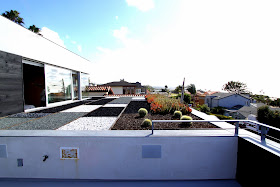
GAWD I love this outdoor terrace rock cactus garden. I tried to keep the pictures to less than ten. The exterior landscape architecture is by Rich Risner of DesignGrounded and the landscape and hardscape is by DC West Construction.
On to the master. These barn doors are all the range. The hardware costs a fortune. And the doors weigh a ton.
Requisite chalkboard paint used on the back of the barn door which covers the master opening.
On the back wall of a room divider was the master bath. I could not get a decent picture. I should have turned on all the lights. Double sinks. No comment. Is a link a comment?
Shower. There was also a bathtub but I don't have a picture! I know, wanton disregard for duties.
The master bath is just behind this room divider wall. E.g. no bathroom doors. Do you like this or does it bug you?
Tour people. She is wearing blue booties. I just wore my neon green socks. Many people like them (my green socks, not the booties).
Are you surprised as to how many people I was really dealing with? Nice work, right?
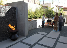
This is the outdoor kitchen with fire feature. I want one.
I believe this is a pizza oven off to the left. It is all built into a hill retaining wall.
Back out we go. One last look at the stairs.
I just love these steps.
Up close of the burned wood. And the shoes for heaven's sake.
The red mail box! You want that?
Please stop for Dwell.
Our third home on the tour was again, mid-century modern modest by McMansion standards. I really like this new housing trend. Our fourth and final home will post tomorrow. It is a good one too. Oh, I love them all.
Note: All exterior design work like plants, stairs, concrete walls, rock gabion walls, roof rock/succulent garden, mailbox, fire elements, pizza oven, etc. were designed by Landscape Architect Richard Risner, Grounded - Modern Landscape Architecture & Planning.
Note: All exterior design work like plants, stairs, concrete walls, rock gabion walls, roof rock/succulent garden, mailbox, fire elements, pizza oven, etc. were designed by Landscape Architect Richard Risner, Grounded - Modern Landscape Architecture & Planning.
Related Posts


I love those steps too, and that cactus garden is amazing. This more masculine home is more to my taste than the pastel, feminine one in your last post. It was pretty, but I'm not much of a girly-girl. :)
ReplyDeleteYou Dana? Not a girly-girl? ;) I wandered around this house in awe. I would turn a corner and gasp. It was stark, but not cold. The industrial materials were so flipping cool. And the cactus garden knocked me out.
DeleteI love that red mailbox. It repeats the lines of the house and provides a cool punctuation mark to the blackened wood. And I like the use of the burned wood, but wonder how they get the charred smell out of it??
ReplyDeleteThe mail box was such a punch! I had questions about the burned wood. Like was it charred and they painted it black? I wasn't sure. It didn't smell. Should have asked!
DeleteHave seen this house in many stages during renovation....the finished project is stunning! Love the cactus garden!
ReplyDeleteMaybe you are a nearby neighbor who lurks around construction projects? Not that there is anything wrong with that! I am so guilty. One of my best sunset pictures is from a neighbors unfinished home. I was going to give him a copy of the picture for a house warming, and then thought... no.... maybe he wouldn't be so pleased. I really want to try that cactus rock garden. Just copy, right?
DeleteAll exterior design work like plants, stairs, concrete walls, rock gabion walls, roof rock/succulent garden, mailbox, fire elements, pizza oven, etc... were designed by Landscape Architect Richard Risner, Grounded - Modern Landscape Architecture & Planning.
ReplyDeleteGreat, added a note and a link at the end of the story. BEAUTIFUL job. I thought it was all stunning.
DeleteI also like the mailbox and have been unsuccessful finding a source. Does anyone know where one can be purchased?
ReplyDelete