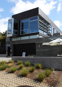
This house is located near the lagoons and coastal bluffs and has some spectacular views from its rooftop deck.
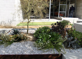
Nice use of poured concrete pads, gravel and concrete flower beds in front entrance. I am ALWAYS looking for modern landscaping ideas.
The home is a cast concrete and masonry block building, with steel beams, concrete foundations and exposed beams all integral to the design. And windows. Tons of windows, with natural sun shades built into the structure, reminiscent of mid-century modern architect Neutra. The windows in the photo below are in the living room and face West-ish.
Pretty, secluded patio in the breezeway between the garage and the home.
Sculptural element in the garden.
This grass area below is supposed to have been a swimming pool, according to the landscaper. The pool will come in phase 2. We all can relate to having to kick items into phase 2. This is a double lot, by San Diego standards.
Another sculptural element. This is a fountain. The water comes out the top.
Gate and fencing. Courtyard wall has a fountain feature.
This lounge room downstairs opens out into the future pool area. The parents have apparently banished the drum set to the downstairs room. In California we don't have basements, so the question of where the band practices is always a challenging one. That is a Murphy bed in the wall. so this private suite doubles as a guest room! Clever.
Elegant orange lounge chair sits in a quiet nook under the stairs.
Up the stairs to the main living area. Stair railing made of steel and industrial wire, surrounded by windows to the courtyard and the side-yard.
LOVE this orange painting in the stairwell. Orange with black and white accents is a theme carried throughout the home.
You come up the stairs straight into the kitchen area. Simple and functional.
From the kitchen you can see the living space.
Windows, windows, windows oriented towards the coastal views.
Creepy hand leftover from Halloween? Music is a big part of this family's life for sure with two different guitars in the main living space.
Cool nook glass office built into the side of the house, and in the main living space. These jutting out glass boxes are a signature item of the architect, Public Digital.
Orange piano!!! This looks to be an older upright piano, lacquered in orange. What a great idea to make a piano part sculpture and all function. POP. Old 60's concert poster hanging above. The birch tree wallpaper provides a stark backdrop for the piano.
View from the living room back to the rest of the home.
Comfortable kitchen counter stools.
Clean lines in the kitchen with traditional mid-century mosaic back splash. Mosaic tile carries throughout the home in the bathrooms.
Another view of the living room.
Dining area sits between the living room and the kitchen. True and highly functioning great room.
Onto the bedrooms. This is not a big house by modern standards. It encompasses 3,200 square feet of living space and was built in 2008. If you exclude the living space downstairs which is a separate room and bathroom that open to the future pool area, the main floor includes only the great room, two small bedrooms, a guest bathroom, and a master suite with master bath. This is VERY mid-century. I overheard a conversation that this home represented a downsizing for the owners, who absolutely DID not want a giant McMansion.
Welcome message. Obviously young female artist. Hi yourself.
Boy's room. The orange detail from the piano carries back with the black/white wallpaper continuing.
Hallway and family art gallery. Nice built-ins.
Girl's room (of the penguin welcome message I presume). More of the black/white wallpaper and feature wall of PINK. Luv. A keyboard in this room. Musical family for sure. These bedrooms are not gigantic by any standard which is fine for kids.
The master bedroom is very simple with a platform bed, stark black wall, and off center window.
Another glass nook with a dresser fitting in perfectly.
Egg shaped tub tucked into another glass nook.
.
Cool fixture over tub.
This is a black outline painting on the wall, continuing the theme.
Master shower with rain shower head and a few bonus other shower heads.
Guest bath. This must be shared by the boy and girl. The mansions of today would have every bedroom with its own en suite bath. Glad to see the owners of this house have the common sense to NOT make their kids too comfortable.
Ta da! Roof top deck! Views to Del Mar natural coastal preserves.
Simple rock and tar roof top. Not set up for a lot of traffic yet. Probably phase 2.
Stairwell up to to the rooftop deck.
All exterior design work like plants, stairs, concrete walls, rock gabion walls, roof rock/succulent garden, mailbox, fire elements, pizza oven, etc. were designed by Landscape Architect Richard Risner, Grounded - Modern Landscape Architecture & Planning.
The Munson residence passes the test. Its modest size, open design and simple floor plan remains true to the principles established by the mid-century modern designers and architects. Details regarding the architect Public Digital, and other resources can be found here. Stay tuned ... three more wonderful modern houses to come this week.
Related Posts
- Dwell Modern San Diego #2: one19 Living Studio
- Dwell Modern San Diego #3: Modern Cardiff
- Dwell Modern San Diego #4: Harris Residence
- How similar are 21st century modern and mid-century modern?


Nice writeup and photos of a really well executed house. The kitchen is especially nice [although I wonder how practical they find the extra wide upper cabinet doors?]. I am over the double lav, also. [It wasn't a helpful enough solution for my ex, anyway... she wanted to shuffle me off to another bathroom on a different floor!]
ReplyDeleteGreat observation on the wide kitchen cabinet doors! I would be curious what the homeowner experience is with that as well ... in terms of running into them, or having the doors block passage -- they sure look good. This home couldn't have been cheap to build, and the lot value alone had to have been enormous, but I found this home to be conservative and economical with its use of space--extremely well designed. The homeowners didn't overdo it and the house would be a pleasure to maintain.
DeleteThe house also seems to be economical in its use of construction materials. I liked the repetition of black and white for various wall art. The simple black branch painted in the bath is especially effective.
ReplyDeleteThis home is very well thought out. There is such unity in the material choices between the steel, the glass, the orange, and the black/white natural tree shape designs. This is a comfortable, efficient home and good looking home.
DeleteGreat house! So many fantastic features. I especially love the rooftop deck idea.
ReplyDeleteIsn't it though? Wait till you see tomorrow. Just as fantastic!
DeleteHmmmmm, I could live quite happily in this one Rebecca..
ReplyDelete(forgive economical comment - should be doing my 'homework'!)
I could live quite happily here too. I love that you stop by Kylie (all the way from Australia), please don't apologize!
DeleteFYI...for the Dwell tour Munson residence and Modern Cardiff.
ReplyDeleteLandscape Architect Richard Risner, Grounded - Modern Landscape Architecture & Planning provided the design work.
Thank you for the note. Added a link. Great job on both properties.
DeleteNow this is what I call creative living space. I bet the architect put a lot of consideration into getting all the amenities to work out how it looks, as well as making sure it's a sustainable and economical living space.
ReplyDeleteLook at what a couple of excavators and a whole lot of concrete and steel can do these days. Now that's my idea of functional art.
ReplyDeleteI like how this is a finer side of modern architecture. I've seen a lot of designs, mostly minimalist-black-and-white or zen, and this is just something else.
ReplyDeleteModern, indeed. The forward-thinking design matched with excellent interiors and the perfect furniture to boot make these great-looking homes.
ReplyDeleteAs far as I can see, all of these pictures are from a single house only. Goodness, it doesn't look as big as it really is. The photos made it big because of the features you took. And the main feature for me is how the masonry bricks and glass with steel beams make it more unique and a certified mid century-modernized home.
ReplyDeleteI may have to agree with what Donna said, they used the right construction materials and it suited the house. I just wish that my house will also turn into this one after we renovate it.
ReplyDelete