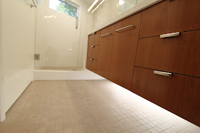
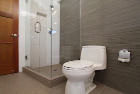
#5 the tile.
Miles and miles of beautiful clean linear tile. I love the plank tiles and I love the white tiles. I love all the tile and very little drywall. The tile was a bit of an expense for sure. But we picked three different kinds of fairly standard Dahl tile, and didn't do all the tricky things that our plans initially called for with the tile. The results are simple and very modern. The white square tile and the mosaic floor tiles are both nods to mid-century.
 |
| Master feature tile wall |
 |
| Master mosaic tile floor |
 |
| Guest feature tile wall |
 |
| Guest with view to angular shower. I love this cool little shower. With the shower head changed to the correct wall (original shot water out the shower door). |
 |
| Alex's feature tile wall |
The master shower is huge, bigger than a fancy hotel. Alex's shower is a fair size. It is nice to be able to stand to the side of the water, shave your legs, or shampoo your hair, or floss your teeth, or whatever you do in the shower. And I like the cool triangle shapes in Alex's and the master showers. Makes it work, and feels really modern. Speaking of Alex, my honest all-time favorite thing about the remodel is that the high school boy (**UGH**) is not using the guest bathroom anymore. But that is more of a result and less of a feature.
 |
| Master shower corner angle, it is big. |
 |
| Alex's shower corner angle, he has the adjustable shower head for obvious reasons. |
 |
| Really nice tiled in window. |
 |
| View to Alex's shower with the disappearing tile pan wall. |
#3 one sink in the master equals two banks of drawers.
Versus two sinks would have equaled one bank of drawers and two awkward cabinets. I am addicted to home improvement and house hunting shows. (My all time favorite has to be House Hunters International.) On these shows, invariably a couple marches into a master bathroom and sequels with delight at the double master sinks. I don't get it. Brush your teeth simultaneously much?
 |
| Double banks of drawers |
 |
| One sink equals two banks of drawers (his and hers), more important in our house then personal sinks. |
#2 the awesome triple-wide medicine cabinet in the master.
When we first discussed the cabinets with various contractors, the custom made mirrored medicine cabinets wired with lights and electrical invariably came up as a crazy indulgence. Why don't we just have mirrors? Can't we buy pre-fabricated medicine cabinets? Doesn't Pottery Barn carry something acceptable? I priced medicine cabinets from every big box and online store I could find and ultimately realized that for not that much more money, we could have custom cabinets, that fit each spot perfectly, have lovely glass shelves and ... wait for it ... electrical outlets built into the cabinets. Custom isn't as much as you think it is. I haven't filled up my two sides yet. And. They. Are. Awesome.
 |
| Triple wide medicine cabinet, see the electrical outlet at the end and the light on the top. The electrician and cabinet guy hated us. |
 |
| I haven't even filled both my sections yet. |
#1 the louver closet doors, plus the additional bonus closet.
Did you guess this would be my top favorite feature? And I snuck in a bonus feature. Having closet doors that open out from the middle with the classy white louver doors on all the closets throughout the house has given me much more satisfaction than I anticipated. Our old closet doors were falling off the gliders on a daily basis, and really did not glide. And, Mid-Century modern homes have NO storage. Adding storage was a critical part of the project and the additional master closet that is a mini-walk in was a glorious treat for sure. I have to give Albert the credit. When we were working with the architect on the bathrooms, he realized that since we were already cutting into the whole back of the house, what would be the big deal if we just extended the remodel another seven feet and created a little walk-in closet for me? Adding eighteen square feet of concrete and roof, incrementally, in the grand scheme of things really wasn't that much money, for the amount of happiness it bought (me). So I count this closet in the bathroom remodel. An unexpected surprise.
 |
| New closet, yay!!! I was worried it would look weird in this spot where the window was, but I like it. |
 |
| Kind of like a walk-in, an unheard of fifties feature. And look, room to grow my wardrobe. |
 |
| Matching louver doors in entrance to master, brightens up room. |
Related Posts:

These pictures of your remodeled bathrooms really are beautiful. Just fabulous. The lighting under the cabinets is a detail I've never seen before - very cool!
ReplyDeleteI can't respond to the top 5 mistakes/not favorite features. I think it is only ourselves that notice these things when we work on something. Beautiful work!
Thank you Stacey. I do like the complicated lighting a lot. You are right, we are so hard on ourselves. But figured I would have to share mistakes in order that others may avoid them.
ReplyDeleteThat has to be the largest medicine cabinet I have ever seen! Although the style of bathroom is a bit more progressive than most bathrooms I have seen, it is so unusual and unique it would be fun to see.
ReplyDeleteBrad Thomas
Classic Clawfoot Tubs
http://www.classicclawfoottubs.com
It is pretty large, isn't it? I like the word "progressive" a lot. Thanks!
DeleteIt says, "Mid century modern remodel." There's nothing remotely mid century about this remodel. It's all early 21st century remodel.
ReplyDelete